How to Photograph Your Ceramics for a Portfolio: A Beginner's Lighting and Styling Guide
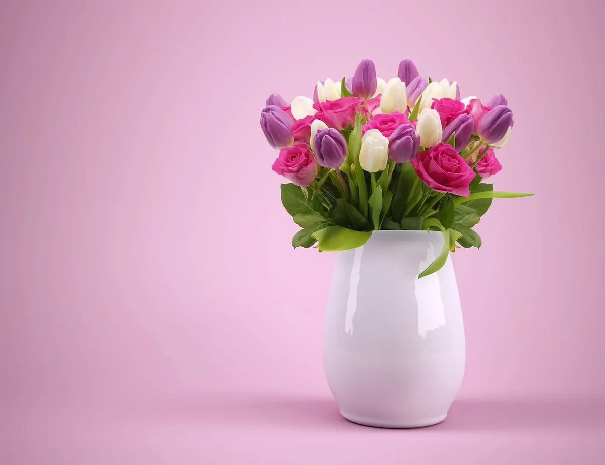
A pot that feels generous in your hands can look flat, grey and faintly sad on a screen. That gap is almost never the camera's fault. It comes from light arriving from three directions at once, a background competing with the glaze, and an angle chosen by accident rather than by decision. The fix is smaller than most makers expect: one window, one sheet of paper, and a handful of positions you can repeat without thinking. Once you have those, photographing a new body of work stops being a chore and becomes a fifteen-minute habit.
Start With the Light You Already Have
The best light in your home is usually the window that never takes direct sun — often north-facing in the northern hemisphere, south-facing in the southern. Light there arrives as a broad, soft sheet rather than a hard beam, which is exactly what a curved, glazed surface needs. You want a gentle gradation from highlight to shadow that describes the belly and the rim, not a bright stripe that flattens both.
Overcast days are a gift. On clear days, shoot before the sun reaches the glass, or tape a sheet of tracing paper, baking parchment or a plain white shower curtain over the frame to soften what comes through. Avoid dappled light from trees at all costs; it reads as damage on a glossy surface.
Then keep it consistent. Set a small table beside the same window and shoot an entire series in one two-hour stretch — mid-morning, say. Move the pot to the light, never the light to the pot. If the weather turns halfway through a session, stop and come back. A portfolio where the background drifts from blue-grey to yellow looks careless, even when the pots themselves are impeccable.
One Light, One Bounce, and a Camera That Stays Still
Turn off the ceiling lights. Mixing daylight with a household bulb produces a colour cast that is genuinely difficult to fix, and it tends to push warm stoneware either pink or green. A single source is easier to read and easier to repeat.
Place the window to one side of the piece and slightly above the rim, roughly 45 degrees. Then add one white foam board on the opposite side to bounce light back into the shadow — closer for a softer, more open look, further away for more contrast. If a pale glaze starts to look like a flat cut-out, put a black card on the shadow side instead. The deeper shadow reopens the form.
Notice how quickly light falls off. A source very close to the pot creates a fast gradient across it; pull it back and the light evens out. Neither is right or wrong, but deciding which you want before you start will save you a reshoot.
The camera matters less than its stillness. Use a tripod, or a stack of books and a folded cloth, and set a two-second timer so your hand is off the body when the shutter fires. On a phone, use the 2× lens and step back rather than shooting up close with the wide lens, which bulges the belly of a vase into something it isn't. Tap the rim to focus, then drag the exposure slider down a notch so the brightest highlight on the glaze holds its detail. On a camera, base ISO and f/8 to f/11 will keep the whole pot sharp from front to back.
Backgrounds That Stay Quiet
Buy a roll of matte paper and tape it to the wall so it curves gently onto the table — a 40cm sweep is enough. No visible corner, no shadow line behind the work. Warm mid-grey is the safest default because almost every glaze separates from it, from tenmoku to a buttery shino.
The exceptions are worth knowing. Pale celadons and chalky whites disappear against a white wall; put them on mid or dark grey. Near-black glazes can lose their edge on black, so choose grey and let the highlights do the describing. Glossy surfaces want matte backgrounds only; a shiny table or a window reflected behind the pot becomes the loudest thing in the picture.
Skip wood grain, patterned cloth and anything with a texture of its own. If you shoot several pieces as a series, keep the same background and the same sweep position for all of them, so a viewer's eye moves from rim to rim and not from prop to prop.
Camera Height and the Three Shots You Actually Need
Most bad ceramic photographs are taken from standing eye level, looking down at a pot on a table. It shrinks the object and exaggerates the top. Get down to the work.
Straight on
Put the lens at the height of the piece's widest point, with the back of the camera parallel to the pot. This is the record shot: true proportions, honest silhouette, the one a juror or gallery needs.
Three-quarter view
Rotate the piece about 30 to 45 degrees and adjust your position to match. This shows the curve of a handle, the transition from shoulder to foot, and gives a sense of volume that a flat elevation can't.
Detail
Move in on the rim, the foot ring, the glaze break, a finger mark left in the clay. One or two of these per piece is plenty, but they are what convince someone the work is worth handling. For bowls and plates, add a shot from slightly above the rim so the interior is visible.
Styling: Fewer Things, Better Chosen
Styling should answer questions, not decorate. A small linen square can give a sense of scale and softness; a single dried branch can imply a vessel's use. Two props is a busy photograph. Five is a still life that happens to contain your pot.
- Clean first. Dust with a soft brush, then wipe glazed surfaces with a lint-free cloth. Wear cotton gloves for dark and glossy pieces — fingerprints show under raking light.
- Find the front. Every pot has a better side. Turn it slowly under the window light and watch the highlight travel; stop where the form reads most clearly.
- Show scale deliberately. A hand, a spoon, an apple — something familiar, at the edge of the frame. Then state the dimensions in the caption anyway.
- Avoid other ceramics. A second pot in the frame invites comparison and distracts from the one you are presenting.
- Check the edges. Look at the four sides of the frame before you shoot; a cable, a chair leg or a plant leaf poking in will be the first thing people notice.
Edit Lightly and Keep the Series Consistent
Set white balance from a grey card or a sheet of neutral paper in the first frame, then apply that same setting to the rest of the session. Straighten, crop to one aspect ratio and leave it there — a portfolio with square, portrait and panoramic images mixed together feels assembled rather than made. Resist heavy contrast and saturation; glaze colour is your reputation, and a buyer who receives a piece that doesn't match the photograph will not order twice. Check the final files on a second screen, ideally a phone, because that is where most people will see them. Export at a sensible web size and keep the files in the same colour space throughout.
A Ten-Minute Setup You Can Repeat
Clear a small table beside your softest window. Tape a paper sweep to the wall. Turn off the overhead lights. Place one foam board opposite the window. Set the camera at the height of the pot's waist, focus on the rim, and drop the exposure a touch. Shoot straight on, three-quarter, then a detail. Dust, rotate, repeat for the next piece. Do it the same way every time and your portfolio will begin to look like what it is: a body of work by someone who knows exactly what they made.
Photo: Yuri_B / Pixabay